Contemporary Hamptons
Maximising existing space and improving flow by transforming the kitchen into a light and cheerful Hamptoms-inspired kitchen.
Scope
Kitchen Renovation
Design Team
Bronz DC
Location
Mount Claremont, WA
Construction Team
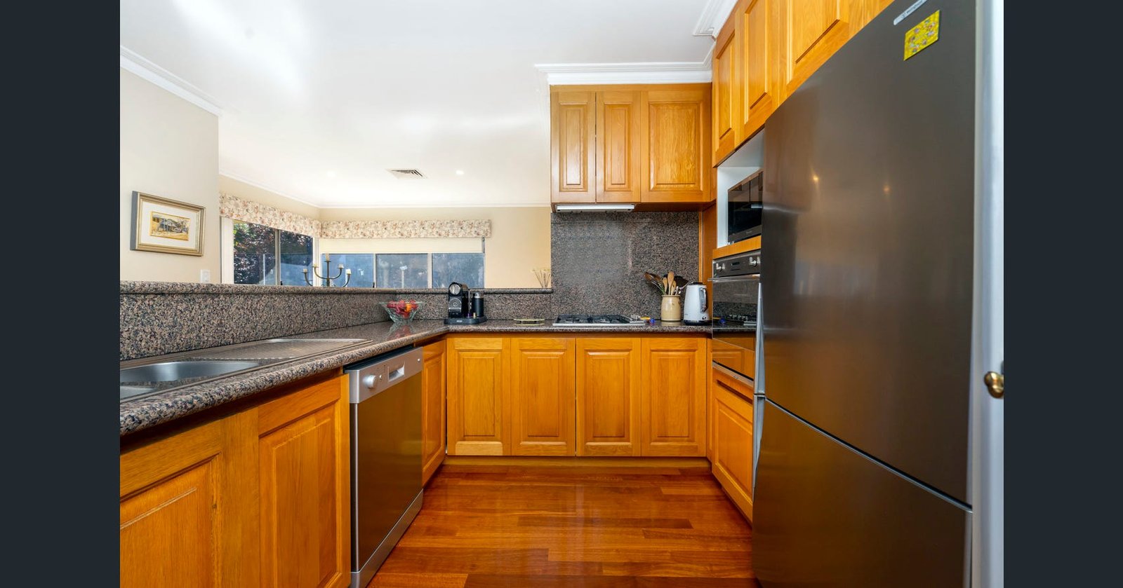
Before
The Story
Tihana and Alex are busy professionals with a young family. They came to Bronz DC with a request to improve their kitchen’s aesthetic and functionality, as well as to provide some additional joinery solutions in other areas of the home. Surrounded by main living areas and doorways to other parts of the home, the kitchen’s footprint was limited in placement, restrictive and tight with several pinch points. The style of the kitchen would have been popular back in the day; however, it did not suit the Hamptons inspired style that our client’s love.
The outcome
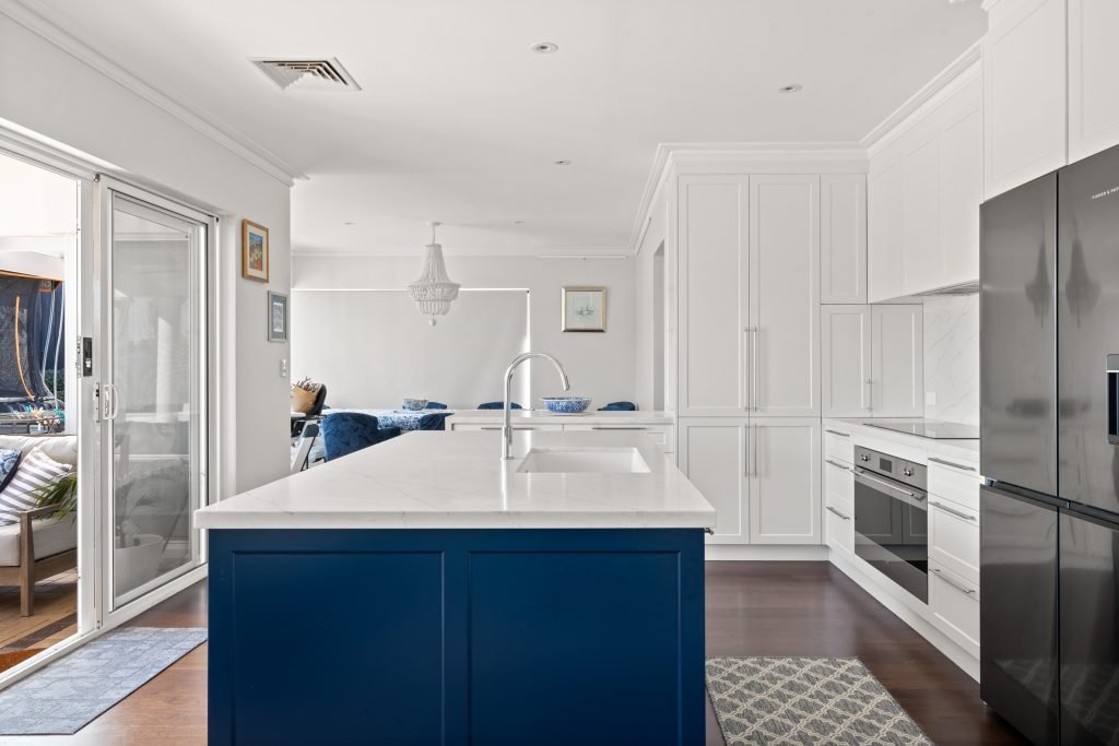
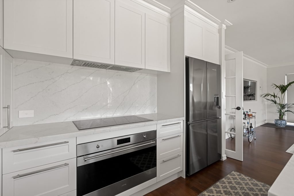
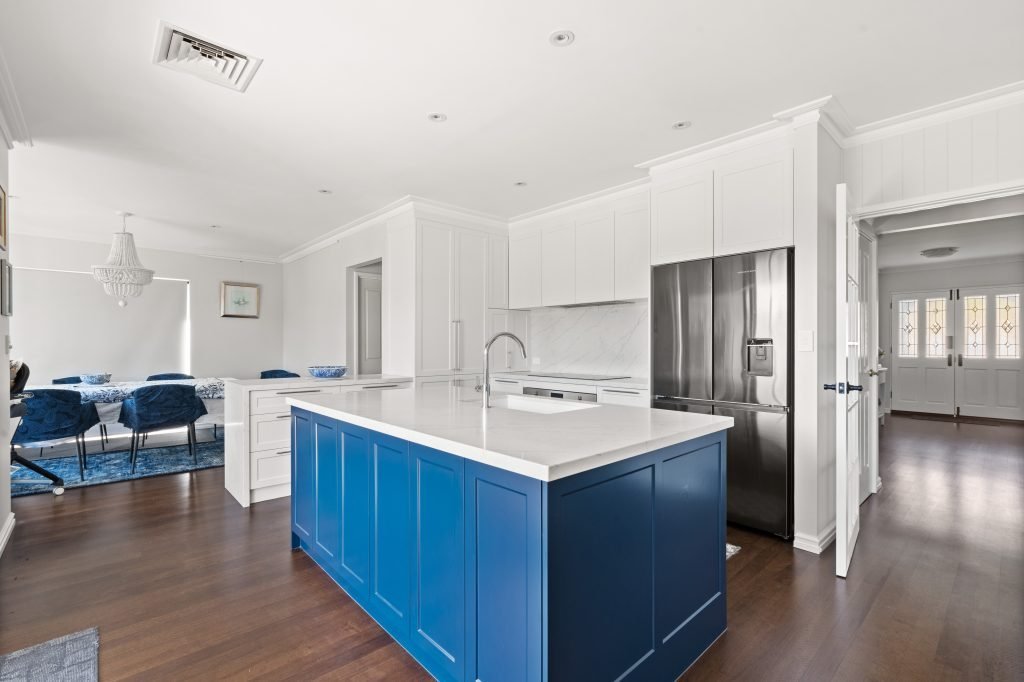
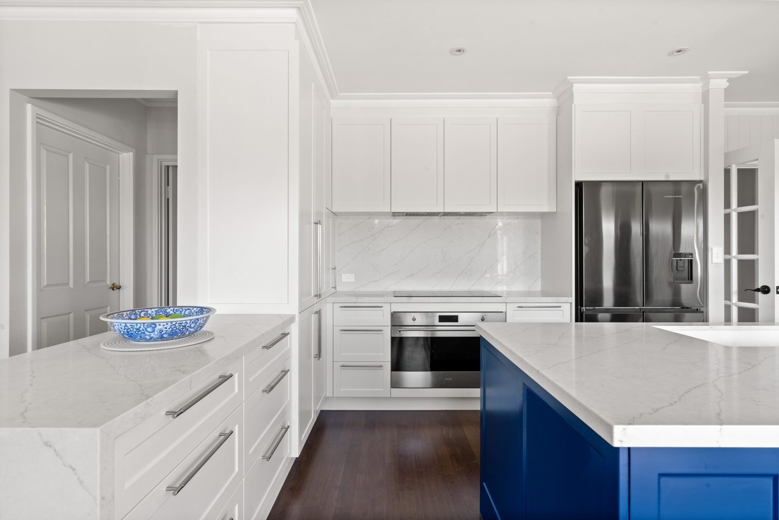
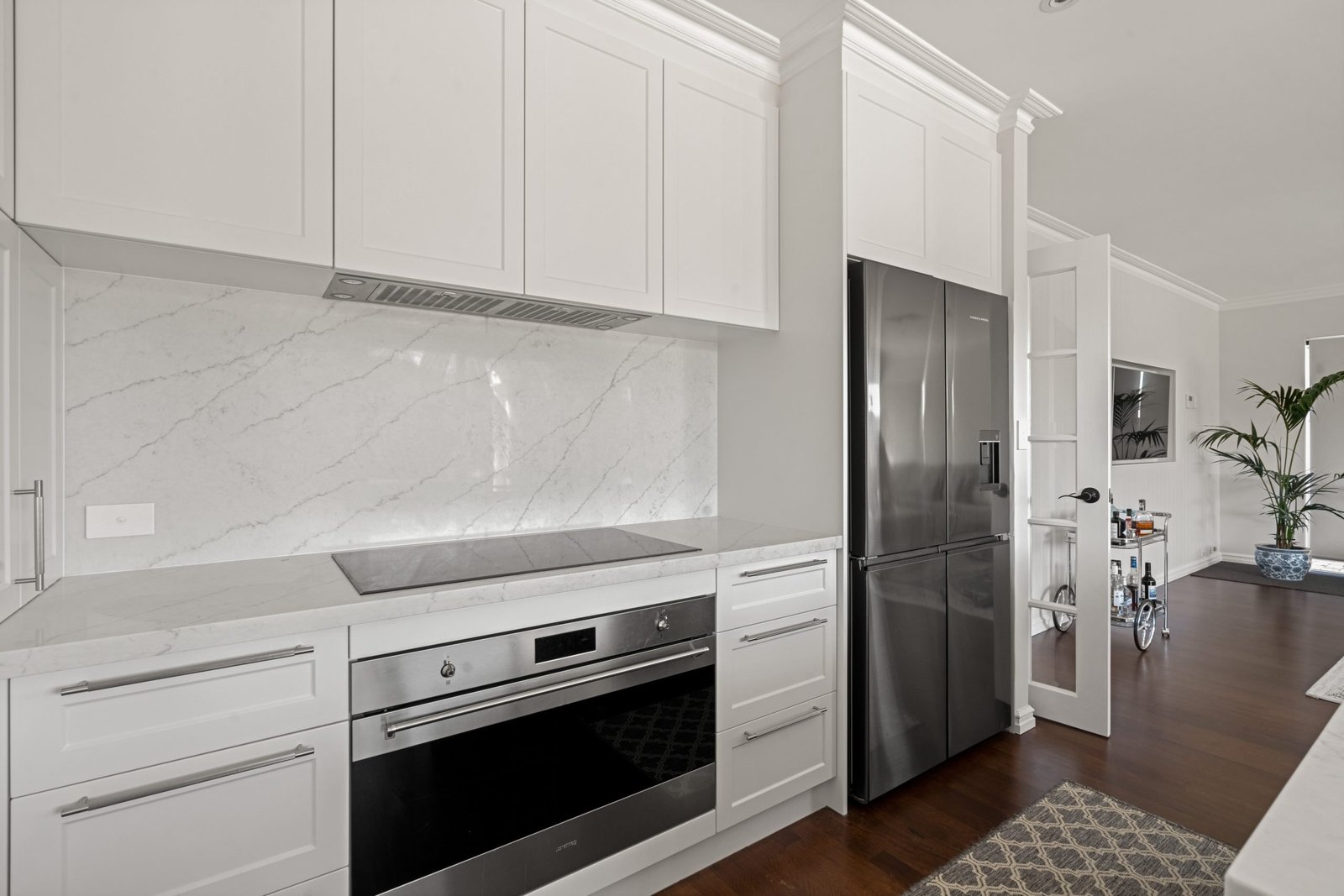
With no room for expanding the footprint, we were forced to explore different design solutions that maximised the existing space. A counter-intuitive approach was taken to detach cabinetry and include a nice deep floating island to provide the much-needed bench space. This also created a second access into the kitchen, instantly improving flow and circulation. We removed the built in pantry brick wall to gain maximum length across the rear elevation and gained more space either side of the cooking station. An appliance cupboard made handy use of the corner and drawers were the ultimate choice for maximising what storage space we were left with.
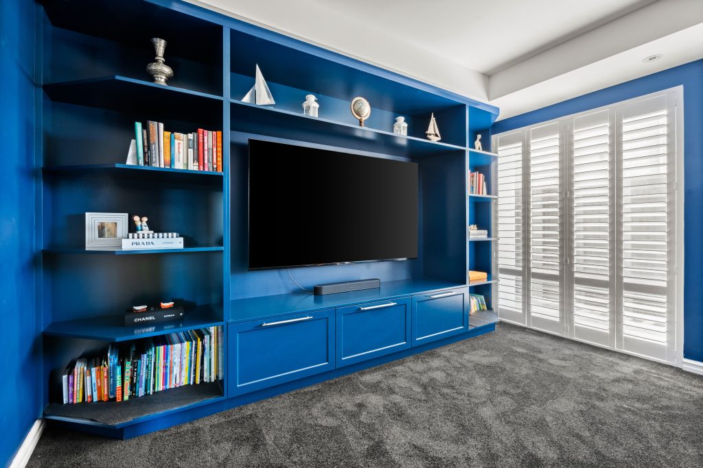
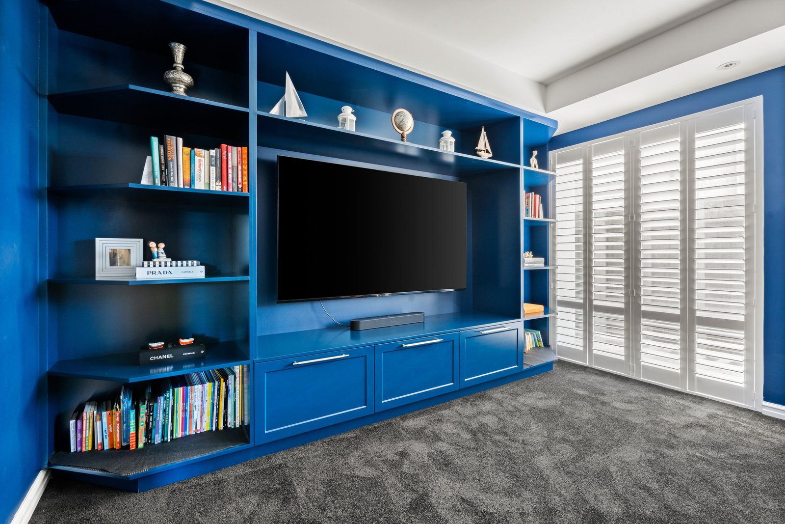
Taking inspiration from the Kara Sea (British Paints) feature wall in the theatre room, we designed a gorgeous blue island for continuity between the nearby rooms. We designed custom joinery in this theatre room in the same colour, both requiring a 2-pack paint application to achieve the desired colour. Engineered stone was selected for the benchtops and splashback, with Stone Ambassador’s Lagos Grey providing a stunning high-end finish to complete this contemporary kitchen design.

After

